
The following blog post was written by Valérie Coveney for Royal LePage – original blog here
July 2, 2026
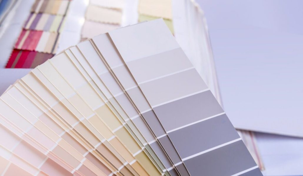
When preparing a property for sale, paint colour is often underestimated as a strategic decision. According to home staging professionals and interior design experts, the right colour choices can meaningfully increase buyer interest and perceived value, while poorly chosen shades can deter buyers before they ever step through the door.
Here’s what to keep in mind when choosing paint colours to help your home sell.
The limits of the all-white approach
For years, the prevailing wisdom in real estate staging was to paint everything white, creating a neutral backdrop that would appeal to the widest possible audience. While white creates a clean look, too much of it can feel sterile, and adding warm elements is often necessary to prevent a space from reading as cold. Today’s buyers are drawn to spaces that feel warm and thoughtfully styled, not clinically bare.
Dark, nature-inspired tones consistently outperform lighter palettes when it comes to perceived value.
Olive green is among the strongest performers when it comes to interior colours. Design experts describe olive green as timeless and grounding, creating a sense of calm sophistication that manages to feel both modern and natural. It performs particularly well in kitchens, where it resonates strongly with buyers looking for a space that feels elevated.
Charcoal grey is a reliable choice for main living areas. Where deeper tones are appropriate, charcoal grey creates a sense of sophistication that buyers respond to positively, and it pairs well with a wide range of furnishing styles.
Medium brown is particularly effective in bathrooms, where mid-tone warm tones create a spa-like atmosphere well aligned with current design trends.
Deep tones overall are gaining ground with today’s buyers. Homes with neutral, cohesive colour schemes tend to sell faster and at higher prices, as buyers generally prefer a clean canvas they can personalize over time. Within that framework, deeper shades of green, blue, and grey outperform both stark white and overly muted pastels.
Biophilic design is a leading trend as well, with the majority of staging and design experts citing the integration of nature into interior design as a top priority for buyer appeal. This reinforces the shift toward earthy, grounded palettes over cool, synthetic-feeling neutrals.
Interior colours to avoid
Saturated, primary colours present the greatest risk to perceived value. Bold colours can be overwhelming, limit buyer imagination, and make spaces feel smaller or outdated. They tend to distract buyers from a home’s architectural features and signal the need for repainting, which many buyers would prefer to avoid.
Exterior and front door considerations
The front door warrants its own analysis, as the colour principles that apply indoors often work differently on the exterior. Buyers consistently value homes that feel welcoming and well maintained, and a staging colour palette that conveys care and attention to detail aligns with broader paint trends, emphasizing balance and a connection to nature.
Colours to avoid on the front door:
Overly saturated or flat tones consistently underperform with buyers. The market is moving away from options that feel either too bold or too flat, as neither creates the strong first impression buyers respond to. Flat or cement-toned greys in particular tend to signal a lack of warmth at the entry, which sets the wrong tone before a buyer even steps inside.
Front door colours that perform well:
Black remains one of the strongest performers for curb appeal. A black front door against a lighter exterior creates high-impact contrast that draws the eye to the home’s best features and is broadly associated with a well-maintained, sophisticated property.
Deep greens and navy are the standout directions for 2026. Across exterior design forecasts, muted greens such as olive, eucalyptus, and deep forest tones are among the most recommended front door colours, with designers describing this shift as part of a broader move toward nature-rooted palettes that feel timeless rather than trend-driven.
Across major paint brand forecasts for 2026, a clear theme emerges: comfort, quiet luxury, and a return to nature, with soft whites, grounded neutrals, forest-inspired greens, and rich browns leading the way for both interior and exterior applications.
Beautiful exterior examples here
Key takeaway
The central insight from staging professionals and design experts is that interior and exterior colour strategies call for different approaches. Deep, atmospheric tones perform well in living spaces, creating warmth and sophistication that buyers respond to positively. On the exterior, high-contrast, nature-rooted choices such as black, deep green, or navy consistently drive stronger buyer interest, while flat or overly muted tones underperform.
For sellers, the practical implication is straightforward. A fresh coat of paint remains one of the most cost-effective pre-listing investments available, and choosing the right colour is simply a matter of understanding what today’s buyers are looking for.